


Context.
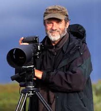
Jasper james is a world known English photographer. Born on the 30th of September 1957, he is currently living in Beijing as he moved from new York where he used to work and also London. He is not only known as a naturalist photographer , but Jasper james also had a career as a song writer for 30 years; he has had the opportunity of being a school teacher and a basketball coach. However, being a photographer has always been the main focal point in his life and has been involved in photography for around 20 years.
Jasper James has spent three years in the London College of Printing photography degree course during the early 90's and also experienced five years working as a photo assistant to various photographers in London and New York. For the past twelve years his experiences have allowed him to develop understanding as a photographer in different areas of commercial photography, such as portraiture, interiors, fashion, travel and advertising.
Jasper James has spent three years in the London College of Printing photography degree course during the early 90's and also experienced five years working as a photo assistant to various photographers in London and New York. For the past twelve years his experiences have allowed him to develop understanding as a photographer in different areas of commercial photography, such as portraiture, interiors, fashion, travel and advertising.
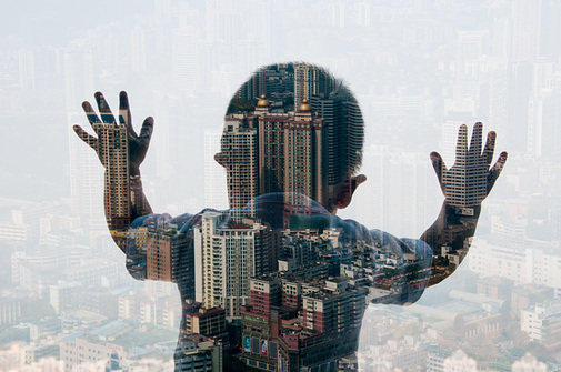
His work consists of layering of a normal profile picture on top of a picture of cities and large buildings. The outcome creates the profile pictures to look as if they are silhouettes. The idea of this makes his pictures look very interesting and avoid the style of an ordinary photograph or a building or people.
Analysis.
What can I see?
The genre of this picture is a combined mixture of landscape and portraiture. In this picture there is a little boy in the centre with both hands placed onto a glass window whilst looking down at the view. The photograph of the boy has been layered on to an image of a large city view to give it a silhouette effect. Jasper James has taken the picture from the back of the child. It is not a full size image as the picture has been taken from the child's chest and above.
In the centre of the image it consist of much clearer detail as you can see large buildings. It stands out a lot more because the child's silhouette has been layered on top of it and because it has a dark tone, its easy to notice. whereas the rest of the picture seems to slightly be fading as it is not as sharp. Towards the top of the photo , the image gradually blurs and the sight of buildings is quite faint. Looking closer to the bottom left will allow you to see much more greenery in the distance and a few house also.
In the centre of the image it consist of much clearer detail as you can see large buildings. It stands out a lot more because the child's silhouette has been layered on top of it and because it has a dark tone, its easy to notice. whereas the rest of the picture seems to slightly be fading as it is not as sharp. Towards the top of the photo , the image gradually blurs and the sight of buildings is quite faint. Looking closer to the bottom left will allow you to see much more greenery in the distance and a few house also.
Feelings & Mood.
Looking at this picture gives me a feeling of abandonment as it gives off quiet a sad effect. I say this firstly because by taking the picture from the back of the child creates a feeling of isolation because he is not engaging with us in any way or even making eye contact with the camera. Secondly the picture as a whole seems to be displaying that he is out in a large city without a family or friend; that gives an impression that he is lonely. Also by looking down at the view would make you feel as if he is searching for something much more , such as his parents. Jasper James has avoided any bright colours in this photograph which adds to the mood of misery because bright colours are normally used as a symbol of joy and happiness.
There is a feeling of innocence because the child looks to be around the age of four and also gives a feeling of pity because the sight of the large buildings and the city makes you wonder whether or not the child will make it on his own.
There is a feeling of innocence because the child looks to be around the age of four and also gives a feeling of pity because the sight of the large buildings and the city makes you wonder whether or not the child will make it on his own.
Why I chose this photograph?
I chose this picture because I like how it is not a complicated photo, the artist has made it simple but effective by layering two very different images that work so well together. Also I find it cute to have a young child instead of an adult because having older people in pictures has become quite common in photographs. It is a good picture because it has been focused and the light and tone has not been used too much so each bit of detail is visible. Furthermore, the simplicity of the picture makes it easier to be inspired and take my own pictures in the same style. Jasper James' pictures are not predictable , which is a good thing because by taking pictures from different angles will help improve my photography skills. This picture has been easy to analyse and I like how much of a story it tells just by looking at it, even though there isn't much going on.
Composition.
The focal point in this picture is in the middle where the little boy is stood. This is because he is the darkest section of the photograph and this makes him stand out a lot more because the rest of the picture consists of light colours which aren't very bright.
By putting the child right in the centre creates a balance in the image because it has been evenly spread out and every bit of his body consists of a part from the city background; This makes it seem as if he is made up of all the buildings. Also I believe it is balanced because there isn't a part of his body that has more detail than the other and the use of the colour black makes this easier to identify because it isn't a vibrant colour.
Firstly my eyes look towards the middle of the picture because it is the darkest part of the picture and although the whole picture has a lot off detail , the middle is the first place I look because the detail in the middle is much clearer and noticeable. Also, the fact that there is more things going on in the middle because you notice that another picture has been layered onto it.
Secondly my eyes look at the background, reason for this is because after looking at the body , towards the edge of the body there is still a consistency of the background but it carries on without any layers and not as bold.
The shape created by the composition is simply a body of a young boy and the artist has made it easy to recognise because the buildings are all in proportion to the child's body.
Colour & Mood.
Faint colours have been used in this picture such as sky blue, pure white and light grey. These colours add life and interest to the work because they're not completely dull colours. Although the artist has not used bright colours, the ones he has used prevent his work from looking boring and actually makes you want to look at it. I believe the dominant colour in the picture would have to be sky blue because that's the colour you see throughout the whole photograph; although the body in the middle is much darker. The artist may have done this to make his work eye catching instead of having to same colours throughout because this can become boring and too simple.
Light & Tone.
I believe in this image the light is coming from the top because this is where you notice the buildings are becoming less visible and it looks slightly blurry. This carries on till the middle of the picture but towards the bottom of this photo there is more of a mid tone and you are able to see the houses, buildings and trees much clearer. However the background as a whole is quiet light which makes the body of the child look as if it is a large shadow.
The tone of this picture adds weight and depth to the work because the darkness of the child's silhouette gives a bold effect and the detail of all the buildings on him makes it seem as if there is a lot going on.
The lighting in the work emphasises the innocence of the child because a more vibrant colour such as 'red' would normally bring negative thoughts or make you think that something bad has happened.
What I have learnt & How will I use what I've learnt?
I have learnt that to take picture from different angles and close up. I have also learnt how to make my work look interesting with light faint colours in order for my pictures to not look complicated. For my work to look as good as Jasper James' I would need to focus on how I will take photos and the specific backgrounds I will use so that my work consists of some bits of detail as well.
Analysis.
What can I see?
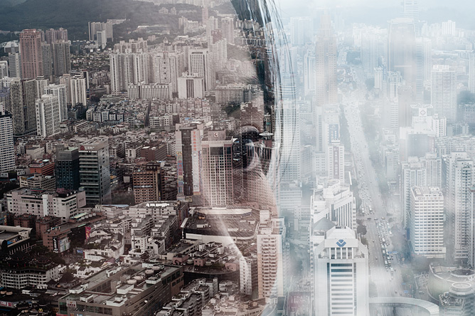
This picture is a landscape image of a girl's face that has been layered/merged with images of a city. The image has been split into two sections; The right side of the picture simply consists of a view of a city that is very foggy and has a mystical sense. This leads me to believe that it is supposed to resemble a polluted city that is gradually creeping up upon us. Whereas the left side of the picture is where the girl's face is present and you see that there is a continuation of the picture of the city but it is much more clearer. There is more colour on the left side which doesn't give a gloomy/ miserable effect. I believe the reason for this is to represent the girl's thoughts on how she wishes the world around could be compared to what the world truly is. Despite all the detail that lies within the buildings, the girl's features are still very visible , for example her left eye stand out a lot and this is due to the focus that was made whilst her picture was being taken. Focusing the image has allowed us to identify the outline of her face so we can spot the difference between the two sections of the picture.
Feelings & mood.
Looking at this picture makes me think about the world and what could be done to make it a better place. The reason for this is because of the use of "fog" and "blur" effects on the view of the city which causes you to dwell on what the world is gradually turning into due to all the amounts of pollution. But making the left side of the picture in colour and much clearer gives a sign that there is still hope in the future to make the world a better place.
Why I chose this picture?
I chose this picture because I was intrigued by the fact that you could actually see the persons thoughts simply by the way the artist has created the image. Although its not a very vibrant picture, the amount of details that lie within the image speak for itself and stand out on their own. By adding any more amount of detail or colour would simply overthrow the purpose of this picture and distract you from the message it is trying to bring. I normally like very bright interesting pictures but this picture came with a simplicity that made it quite interesting. The details in the city have been created like pathways; this shows that the artist has thought about the lines in the picture that almost give an effect of a "maze" which cause you to want to know where the lines are leading to. This is a perfect example of how to make a photograph interesting and tell a story without the use of words or extra detail.
Composition.
The first area I look at in this picture is the left side because there is more colour in this area and actually more amount of detail compared to the right side as this is where the girl's face is and the features of her face are also present. By having her face layered on top of the buildings gives a feeling as if the left side is much more denser than the right side because there is more going on. I believe that the left side of the picture is the focal point as this is where the face/ colour consists of and it has a much more brighter sense because of the use of lighting and colour. As you move towards the left corner the image of the buildings that have been layered with the face is much more clearer and you can actually see the view of the city at a much clear point as it has been focused really well.
Colour & Mood.
There has been a range of colours used in this picture. The first set of colours that were used on the left side of the picture created a more calm and and slow atmosphere; Colours such as ice blue, a dusty grey and pure white. These colours were enforced to create the idea of pollution and corruption that we are surrounded by. Whereas the right side had a hopeful sense because colours such as maroon, black, red ,white were on the buildings. Also the colour peach was quite dominant as it was the colour on the girls face therefore is was very visible. I believe that the colours in this picture have not balanced out completely as there has been more colours used on the left side which is the reason why it is the area my eyes divert to straight away.
Light & Tone.
I believe that there has been a balance in the lighting in this picture because there are no darker areas or even lighter areas. The artist has created this picture so that the light is shining throughout the whole image and this makes it slightly difficult to identify where the light is actually coming from. However I would say that the brightest part of the image is the right side of the picture because lighter colours such as white and blue have been used. This has simply proven that you can use colours to change how much light there is in a picture.
What I've learnt?
Studying this piece of work has taught me how to create a mood in my picture with the use of dark and bright colours. Doing so will prevent my picture from losing detail by the use of extra lighting ; Also preventing over-exposure from occurring. Lastly I learnt how to use the blur tool without making it obvious to the viewers. This will prove my skills in blending an image and making the picture look more realistic.
